My Blog
Educating, community and inspiration is a core part of who I am. I’ve learnt a lot in my 7 years of Photography and being a small business owner, and where I can, I want to help you avoid some of my poor choices, as well as achieve some of the joy and proud moments that I have!

My latest Blog posts:
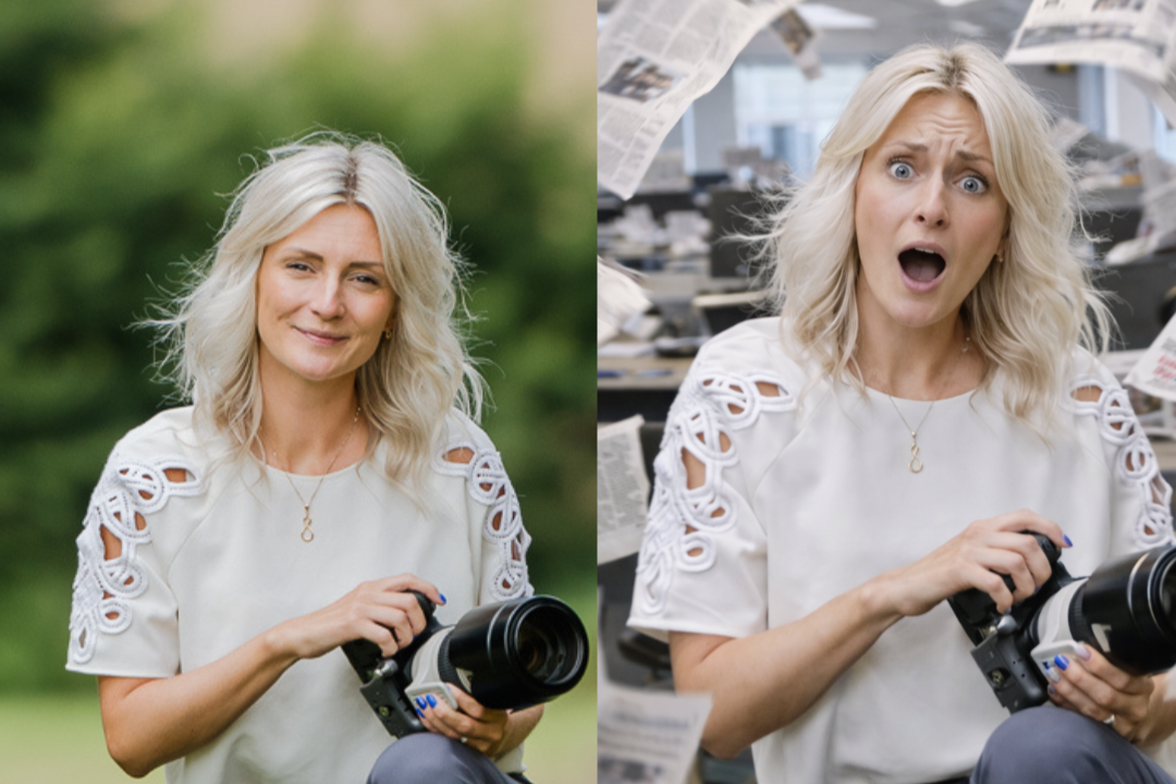
Can AI Really Replace Taking Real Photos and Content for your Business?
Let’s talk about the elephant in the room? AI is an incredible tool - but it is just that. A tool. It can support and save you time, but it’s not the master of authentic creation and making ‘REAL’ connections.

How to Use Your Branding Shoot Photos to Their Full Potential
Too often, people sit on their new business photos for months or only use them sparingly, like updating their website or posting on social media once in a while. If this sounds familiar, you’re not alone, but the truth is: you’re not getting the best value out of your branding photography. Let’s explore how to make the most of them and why it’s so important to put them to work for you.

Top 5 Branding Shoot Mistakes to Avoid
A branding photoshoot can transform the way your business is perceived online, helping you build trust, connect with your audience, and stand out in a crowded market. But a successful shoot requires more than just showing up in front of the camera. As a brand photographer, I’ve seen many common mistakes that can derail your shoot—and your brand image—before it even begins.
Here are the top 5 branding shoot mistakes to avoid, ensuring you get the most out of your session and leave with images that truly represent your business.